My name is Nicola Lux
and I am a media designer.
I take photographs, make
illustrations, interactive
experiences, websites and
more...
hello
13/03/1996
birth, Bad Reichenhall
05/2014
Abitur, Annette-Kolb Gymnasium Traunstein, Germany
9/2014 - 5/2015
work and travel, New Zealand
10/2015 - 3/2019
bachelor studies mediadesign, Hochschule Hof, Germany
10/2016 - 8/2017
tutor for interaction design, Hochschule Hof, Germany
9/2017 - 2/2018
internship at Nerdindustries GmbH, Hamburg, Germany
3/2018 - 7/2018
semester abroad, Multimedia University,
Kuala Lumpur, Malaysia
10/2018 - 3/2019
working student, Hochschule Hof, Germany
4/2019 - 11/2019
freelance work, Den Haag, Netherlands
12/2019 - now
mediadesigner at Carbon Black Technology, Den Haag, Netherlands
short vitae
nicola lux
info@nicolalux.de
mediadesigner
Light-up collective
As a freelancer I created the website of Light-up
Collective, an art collective in Utrecht, which mainly
works in projection. The website represents the
artsy approach on projects as well as the innovation
and the unique work environment of the collective.
The main navigation through the page is created via
scrolling. Elements appear and disappear by moving up
and down the site and giving the user a exceptional
experience. The website is created with Webflow.
view website
webdesign
Light-up Collective
webdesign
freelance work 2021
ZukunftsOrte
ZukunftsOrte is a organisation, that works on
creating villages, where people of all ages
can live together in an sustainable way. According
to their ideas and wishes I created their website.
I developed it with Wordpress and Elementor,
searched for fitting images and designed their logo
and icons.
view website
webdesign
ZukunftsOrte
webdesign
freelance work 2021
Carbon Black Technology
Carbon Black Technology is an innovative
company that produces black and transparent
projection surfaces. As the company‘s
designer I was responsible for creating a
brand identity from scratch. By analysing
the company‘s target groups, unique selling
points and brand values I developed the
look and feel of Carbon Black Technology. I
defined the brand‘s main characteristics like
colour schemes and fonts and designed the
main and secondary logos. In the next steps
I started working on the company‘s website
as well as brochures and other marketing
and communication material. A lot of the
photo and video footage that can be found
there were created by me and my coworker.
branding
carbon black
technology
corporate identity
Carbon Black Brochure
During my first year of working at Carbon
Black Technology, the company‘s focus on
target groups had expanded. This meant that
while staying attractive to our usual group of
clients, we were now also trying to engage
with possible investors.
After studying our competitors‘ solutions,
we decided to work on a picture-heavy,
visually attractive approach. I designed a
clean looking brochure for showcasing our
main products and adapted the deck and
other brochures to this visual identity. While
keeping the character and recognisability of
the brand identity through reusing elements
like logos, font and the line-art style, I
overhauled the layout to create a more
structured and clear image.
redesign
carbon black
brochure
redesign 2020
yourself?
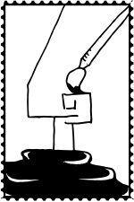
In this project I experimented with a Kinect
camera and a holographic screen. I used the
data that the Kinect sent out and wrote a
code with Processing to make sure that the
result would appear on the screen without
any background.
On the projection screen you can see an
exact copy of the participant appearing in
3D. This way the viewer is able to interact
with himself as well as with the copy of
others, who could even be in another room
("telepresence“). Furthermore, I tried out
different ways of modifying the captured
image resulting amongst other things in
abstract patterns that are created individually
and live by the user with his/her own body.
interaction design
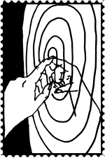
yourself?
interactive hologram
2020
spread - verbreitet
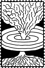
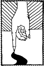
My Bachelor work was about death and
care. I examined the possibilities of terminally ill
people to get help and support. Out of my
research I developed verbreitet. It is an
interactive information graphic, which shows
the location, the founding year, capability, name
and phone number of palliative stations and
hospices in Germany. These facilities are
specialized on treating of people with terminal
illnesses by not only caring about the
symptoms of the body, but also on the
mental, spiritual and social needs.
information design
verbreitet
part of my bachelor
work
all kinds of illustrations
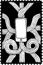
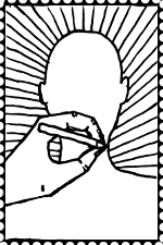
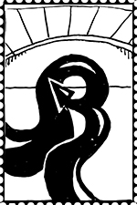
In my internship at Nerdindustries I learned a
lot about illustration. I drew motifs for shirts
and hoodies for my agency.
I also created illustrations for private projects.
I design cards, covers, posters and small
elements supporting my design.
illustration
all kinds of
illustrations
over the past years
insight
scratches in paint
smooth skin
delicate and vulnerable
hard like steel
A blink of the soul
A flash of desire
vulgar and elegant
twisted world
worldly twist
insight
ein Blick (original)
Kratzer im LAck
glatte Haut
zart und verletzlich
hart wie Stahl
Ein Blinzeln der SEele
ein AUfblitzen der Lust
ordinär und elegant
Verdrehte Welt
weltliche Verdrehtheit
ein Blick
photography
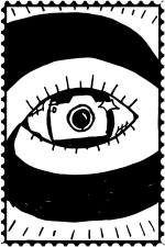
insight (ein Blick)
final work of photo-
graphy class s4
moiré
Moiré is one of my interaction design -
projects. In the second year of my studys
the class interaction design did a cooperation
with the theater in the neighboring city Hof.
Every student created his or her own project.
I developed a tool for creating a moiré. The
moiré - effect works with optical illusion and
creates the impression of movement. My
plan was to use the facade of the building
to advertise the Hofer Theatertage (an event
hosted by the theater) by using the moiré -
effect. The illusion can be seen by cars
or pedestrians that are driving or walking by
the building. With the help of my tool I was
able to create a lot of different moirés in a
short period of time. The topic was Schicht-
wechsel (layer change).
interaction design
moiré
work in cooperation
with the theater Hof
gloomy cubes
In my internship at Nerdindustries I got the
task to create a thermochromic picture for
an exhibition at Stilwerk in Hamburg. I
developed a geometrical pattern which creates
different perspective illusions by showing
only some parts of the picture. The different
patterns were created by using small heating
plates, controlled by code.
view case
art